The Works: UX and Content Strategy
 The challenge
How might a museum make the arts and sciences both engaging and accessible?
 About the Project
Museums serve communities. Hands-on activities educate students and teachers alike. With an impressive array of exhibits and workshops, the museum serves current and aspiring artists, educators, and engineers. The previous website, however, did not adequately support these efforts.
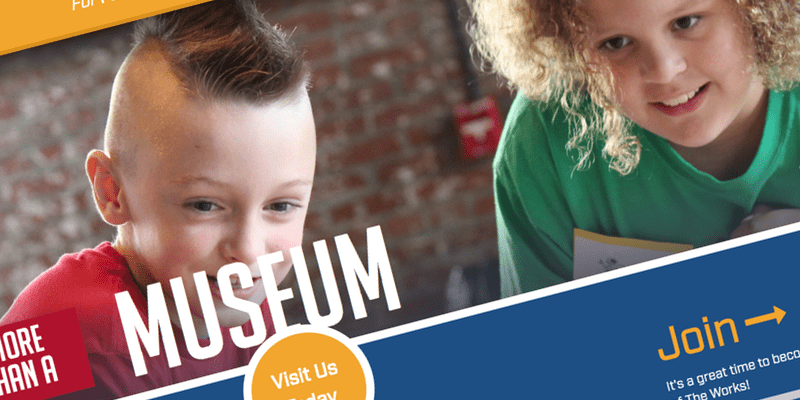
The old website’s structure made browsing a burden. Visits were hard to plan. Programs were hard to find. In addition, the website’s design complicated maintenance, as new content would be glommed onto an unwieldy set of screens and forms. Core user needs, such as finding the museum’s hours and parking information, were buried underneath a morass of outdated prose and past exhibits. The website needed to undergo a complete overhaul of its information architecture.

Improved speed

Better readability
More accessible
Page reduction
“Visits were hard to plan. Programs were hard to find.”
Working in conjunction with the client team and their partner agency CNTXT, Edward Stull Consulting developed a comprehensive plan. The plan included an expansive strategic assessment, a full set of supporting wireframes, and a detailed content matrix.
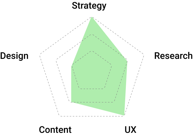
The assessment set three guiding principles for the new website: Simple, Usable, Relevant.
Simple
We highlighted the museum’s offerings by creating a lightweight and flexible information architecture, organizing all website information in logical and predictable ways. We improved the website’s information architecture by doing the following:
- Reduced the number of top-level content silos, thereby decreasing the number of initial choices a user had to make when first visiting the website.
- Made each screen solve a problem. If we didn’t know what purpose a screen serves, neither would our users.
- Removed distracting callouts and ornamentation that diverted users from completing a goal.
- Aligned user needs and business goals. For example, we increased visitation by featuring the museum’s daily events.
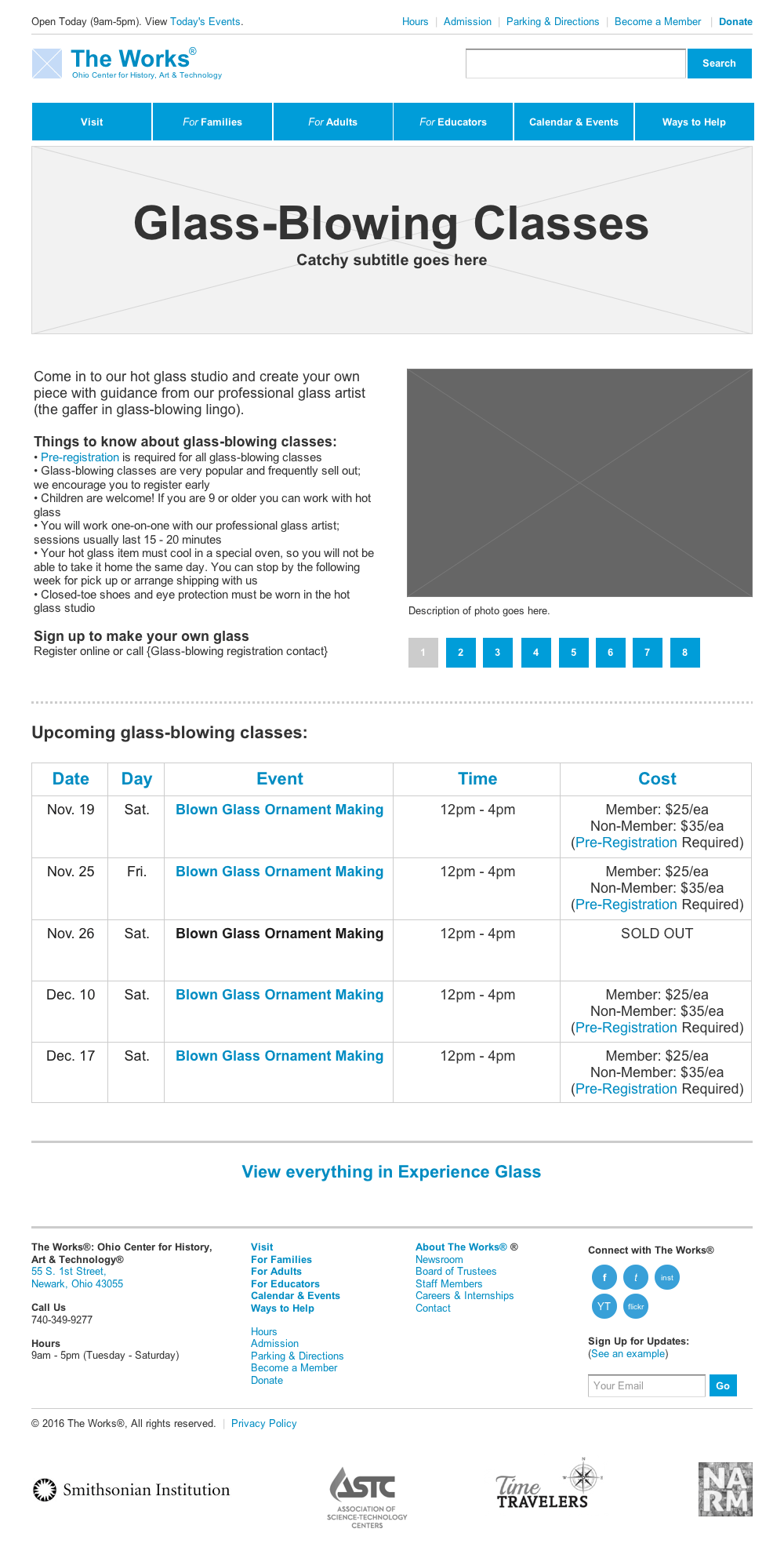 Wireframe of a classes template ( View image )
Usable
A good user experience is a usable one. We provided clear and unobstructed interfaces to ensure users could easily access content, regardless of the users’ capabilities or devices.
- Improved speed. We recognized that the single best way to improve the website’s UX is to make it faster. Optimized images, limited scripts, and refactored code all improved site performance. We designed the small screen (mobile) views to be ruthlessly efficient.
- Enhanced accessibility. When we made the website more accessible to disabled users, we improved the performance of the website for all users. Inclusions of alt-tags and well-structured HTML greatly enhanced accessibility.
- Improved readability. We established minimum font sizes and efficient line lengths that were clearly legible and readable on both large and small screens.
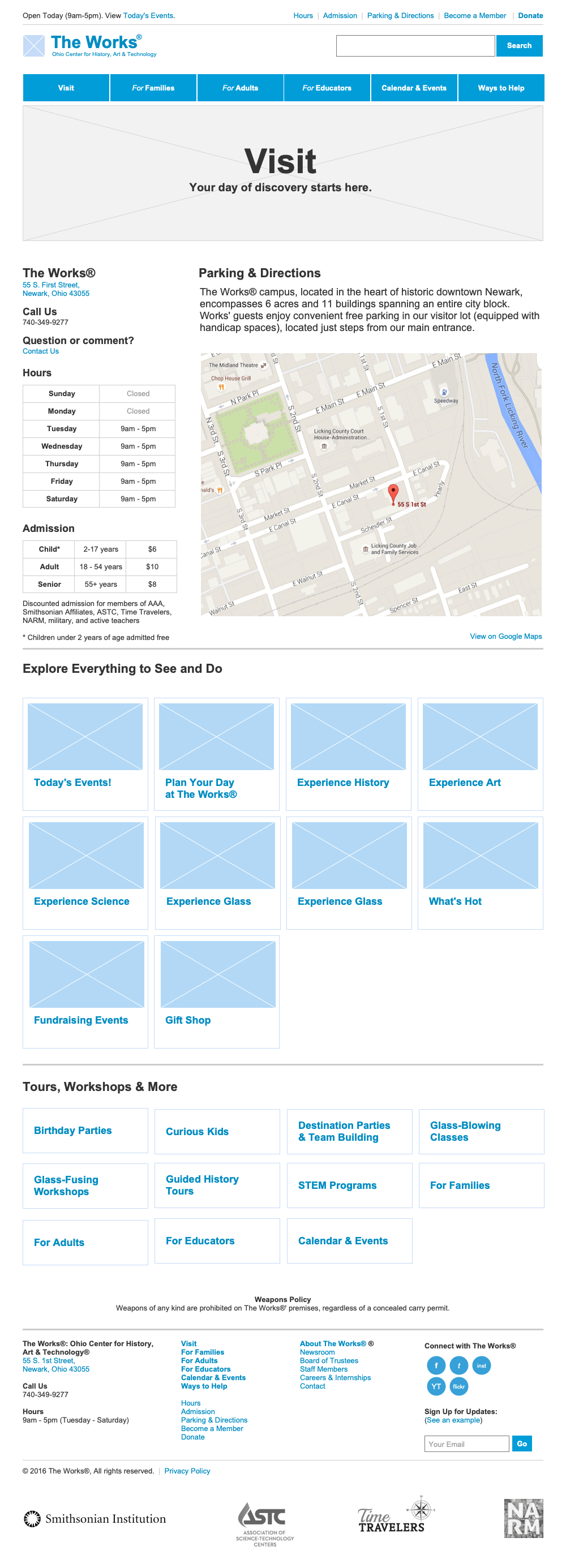 Wireframe of the Visit landing screen ( View image )
Relevant
Relevancy affects how users perceive and how search engines evaluate a website (i.e. SEO). The more relevant we made the content, the more we improved awareness, engagement, conversion and retention.
- Considered the target persona(s) of each page. Each page had at least one target demographic persona (e.g. Kids, Adults, Educators). Such a tactic helped organize content based on relevancy to its intended users.
- Featured one item per page. Be it a callout, a photo, or a block of copywriting, an item was featured only when it expedited an intended goal.
- Found an age-appropriate sweet-spot for the site’s user interface (UI). The prior site appeared somewhat childlike, with its colorful borders and whimsical fonts. A more sophisticated UI complemented the new brand positioning, as well as communicated to a wider audience.
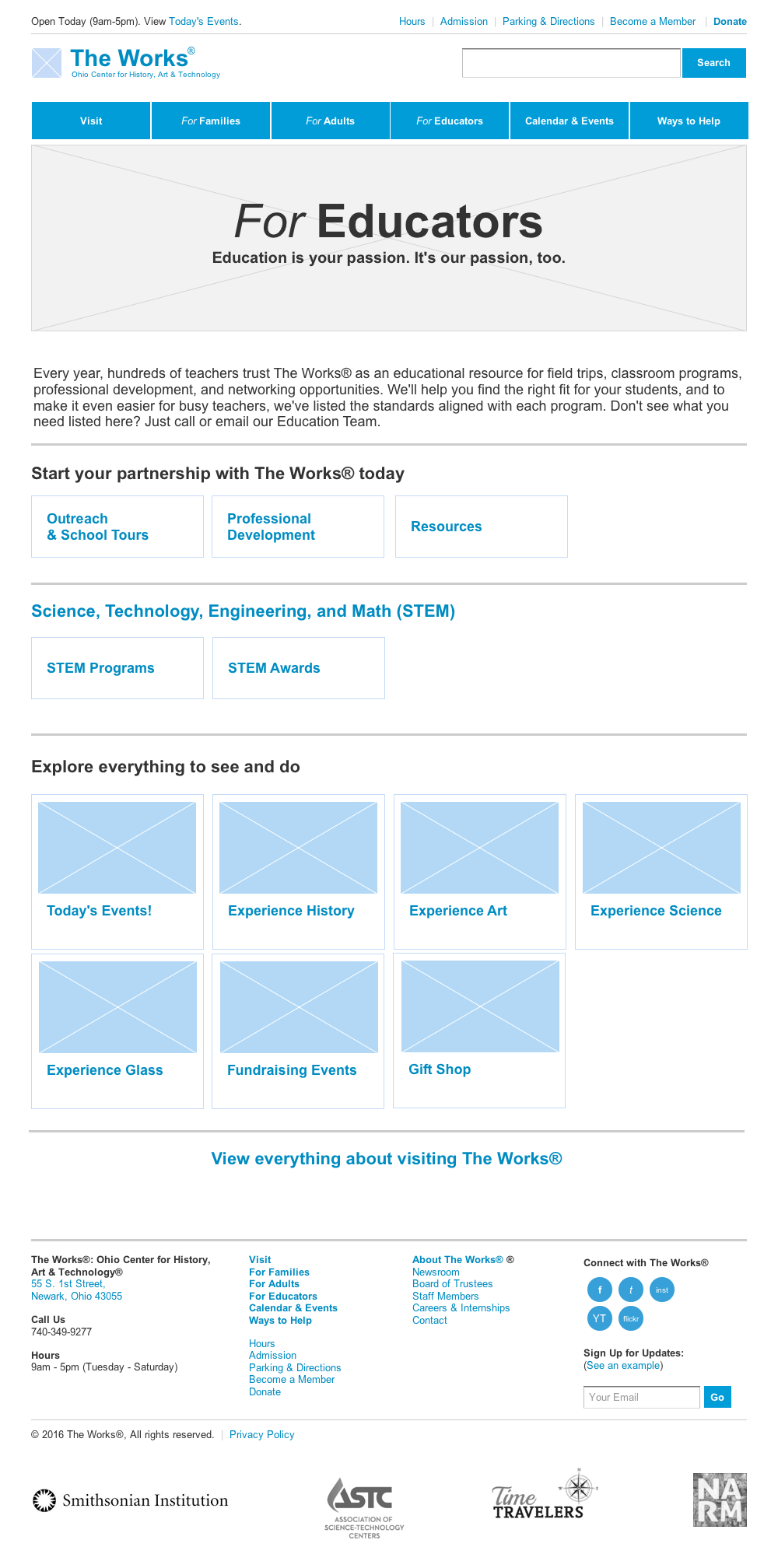 Wireframe of an educators category screen ( View image )
 Screenshot of audit detailing content pace layers ( View image )
Other Notable Projects
- UX Fundamentals for Non-UX Professionals book published by Apress Springer Nature
- UX Collective stories published on the independent design publication on Medium. For example, here is an article I wrote about the The UX of Gift-Giving.
- The Startup stories published on Medium's largest active publication, such as this article about Selective Perception