Ecommerce: UX Research, Strategy, and Design
 The challenge
How might a luxury brand website differentiate itself through its user experience?
 About the Project
High-end eyewear brands compete across a wide spectrum – both figuratively and literally. They differentiate their products through brand positioning, innovative material design, and advanced manufacturing techniques. Yet luxury brands websites often fall short, favoring the appearance of opulence over the needs of users.
 Cropped mockup of homepage ( View image )
At first glance, the differences among sunglasses would appear to be merely cosmetic – styles, shapes, and colors. However, such differences are minor in comparison to their underlying optical and material attributes as well as use cases.
Consider polarization. A high quality pair of polarized lenses reduces eye strain, making colors more vibrant and eliminating glare. Boaters and anglers love them. Polarization removes the glare of sunlit water, which is caused when the number of lumens exceeds your eyes’ ability to absorb the light (usually around 4000+ lumens). That’s helpful when you’re piloting a schooner or fly fishing for salmon.
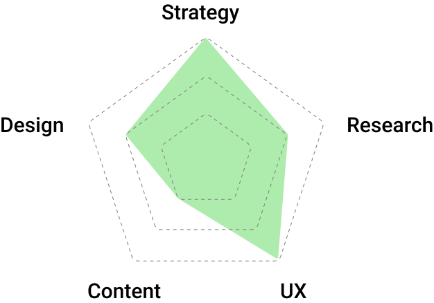

Unified architecture
Revenue (est.)
Visits from search
Mobile visits
Mental models and user journeys
Classifying materials and use cases into a testable taxonomy produced an improved information architecture for the future website. In addition, once the classifications were revealed, opportunities for new tools and functionality emerged.
Usability tests revealed a pernicious issue: users did not correlate brand content with product pages. Essentially, the prior site was divided in two – one section discussed virtues of the brand and its technology, another section represented the shopping experience. We realized we couldn’t be a little bit e-commerce; we either did it well or poorly.
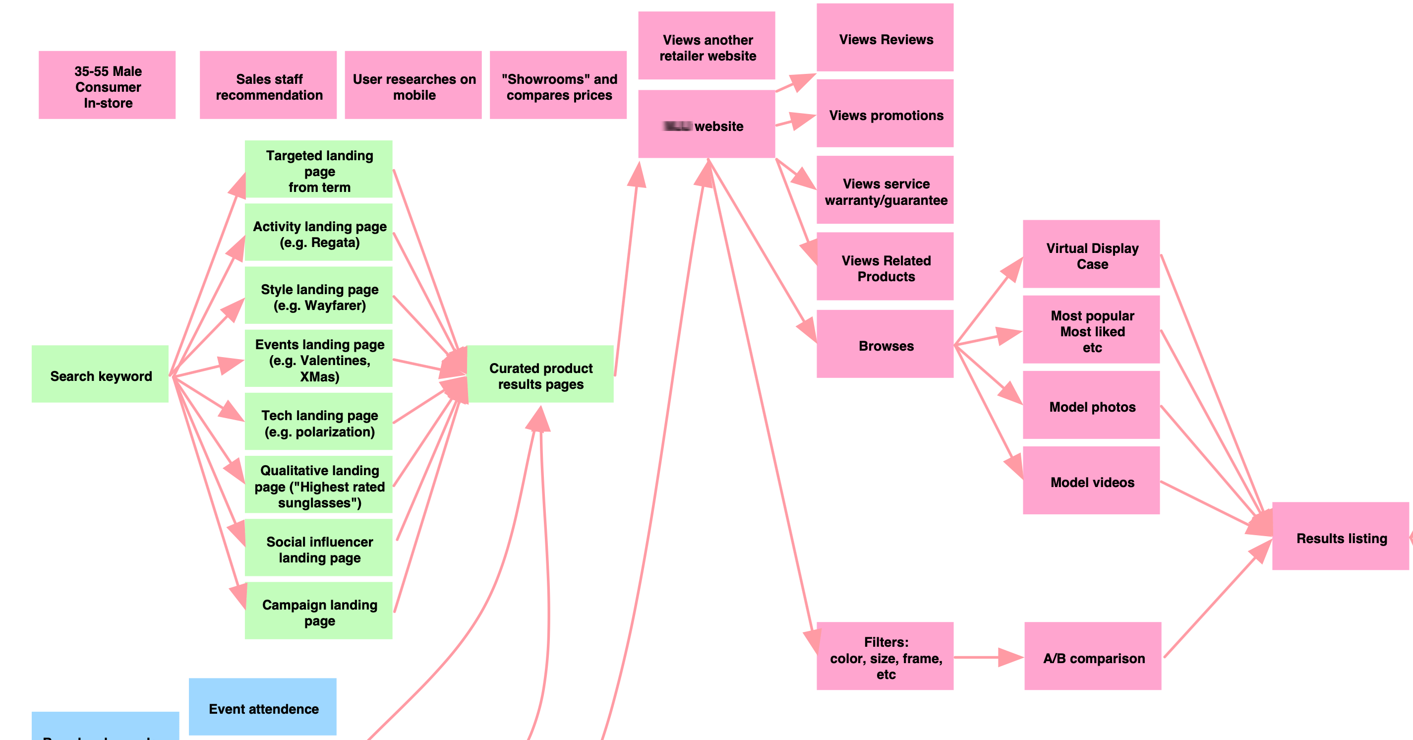 Partial user journeys ( View image )
Multiple entry points
Users shop obliquely. They can enter a website from myriad external sources – social share, search query, email, or ad. Often, users began their experience on a page other than the homepage. So we designed a structure that provided relevant content at each entry point. We had to convince the user on every page.
"...we designed a structure that provided relevant content at each entry point. We had to convince the user on every page."
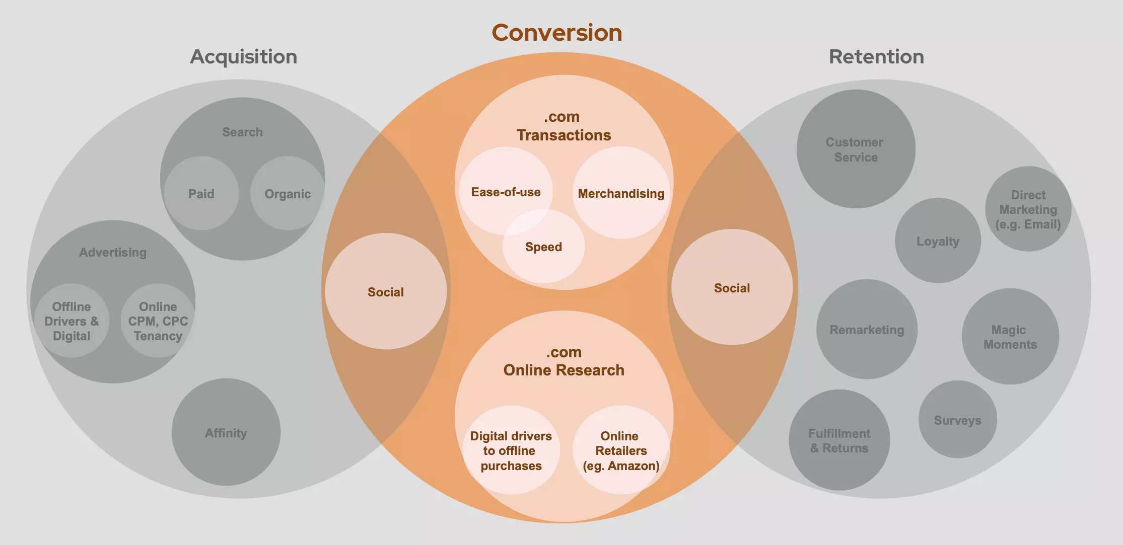
Linking brand with functionality
We designed multiple ways to present brand content in relation to product pages, interlinking the two. The redesigned site made it easier for consumers to learn as well as purchase. For example, the new site architecture elevated products within branded content and increased the prominence of the brand within product pages.
 Homepage featuring multiple messaging areas (MMA) ( View image )
DIY VS. DIFM (Do It For Me)
User and stakeholder interviews indicated a strong proclivity to shop by style alone. Yet, many users still wished to be guided through their selection process. We employed a "Help me choose" tool that filtered the product catalog. It was displayed as a thin band running across the top of menu and result pages.
 Mockup of several steps from the product selector ( View image )
Understanding context
Historically, the website saw roughly three times the amount of traffic during the summer months compared to colder times of the year. Holiday buying around mid-December and the day before Valentine’s Day nearly equals that amount of visitation. Creating SEO/SEM-friendly landing pages and content could more effectively capture these opportunities. Additionally, improving the relevancy of common event-based and category-specific pages (e.g., "gifts for men") would decrease future CPC spends and increase organic search profiles.
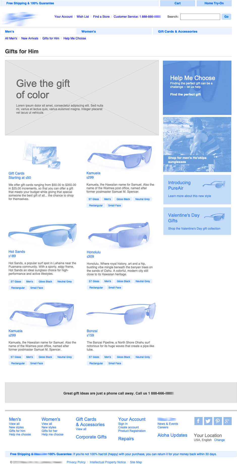 Wireframe of tailored landing page for owned, earned, and paid media targeting ( View image )
Reframing luxury eyewear
We wanted to better serve the website's audiences. The new design guided users, helping them understand and evaluate products. Product pages matched key messages with product benefits, progressively disclosing the right content at the right time. We reduced users' efforts, removing unnecessary form fields. After all, shopping is a conversation, not an interrogation. Keep it simple and keep the sale.

Purchase decisions
Product detail pages were the workhorses of the website. They served as inbound targets of user searches and marcom campaigns. Each page contained a wealth of information to support a user’s purchase decision, including the appropriate mix of branding and material fit-and-finish details.
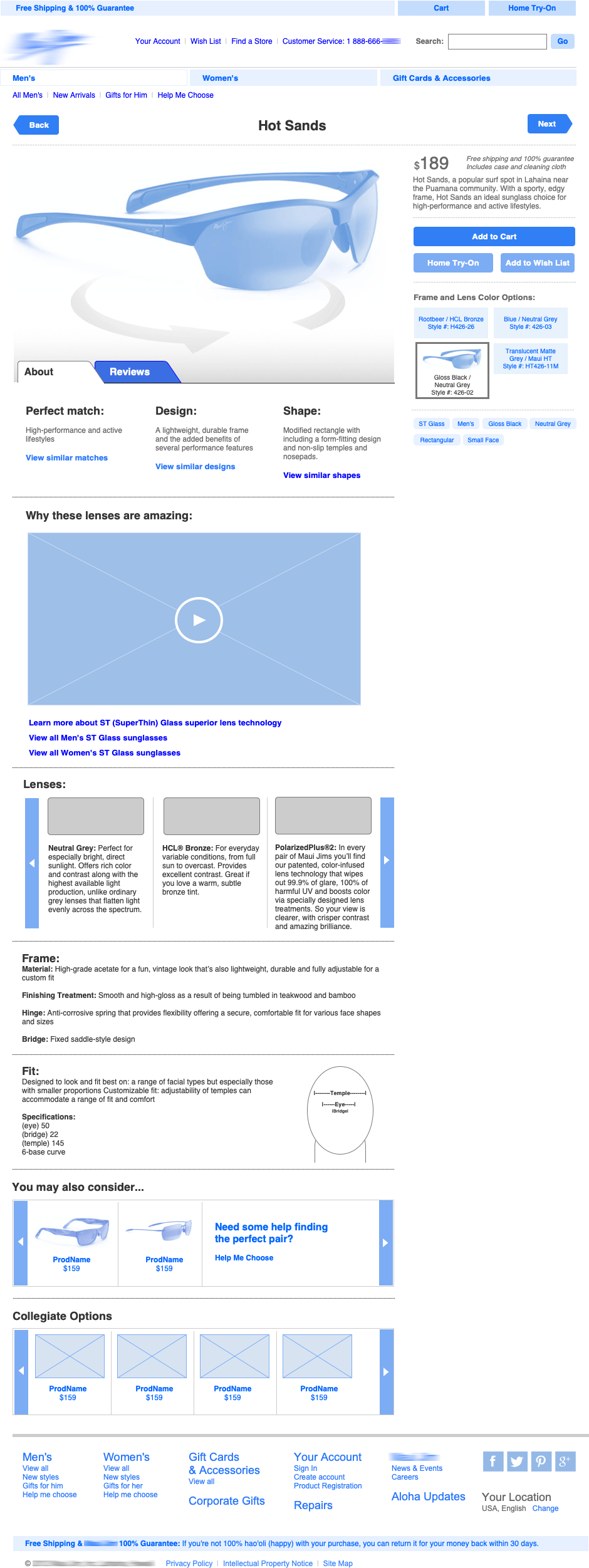 Wireframe of product detail screen ( View image )
Product detail screens showed a mix of product details, material explainers, helpful guides, branded content, and related proof points. Such screens served as readily available targets for owned, earned, and paid marketing efforts. Comprehensive content enhanced the page's search engine relevancy as well.
Lenses of lenses
Based on users' browsing or shopping behaviors, they interacted with the product catalog through multiple lenses: filtered product views, a virtual display case, or branded content (as shown here).
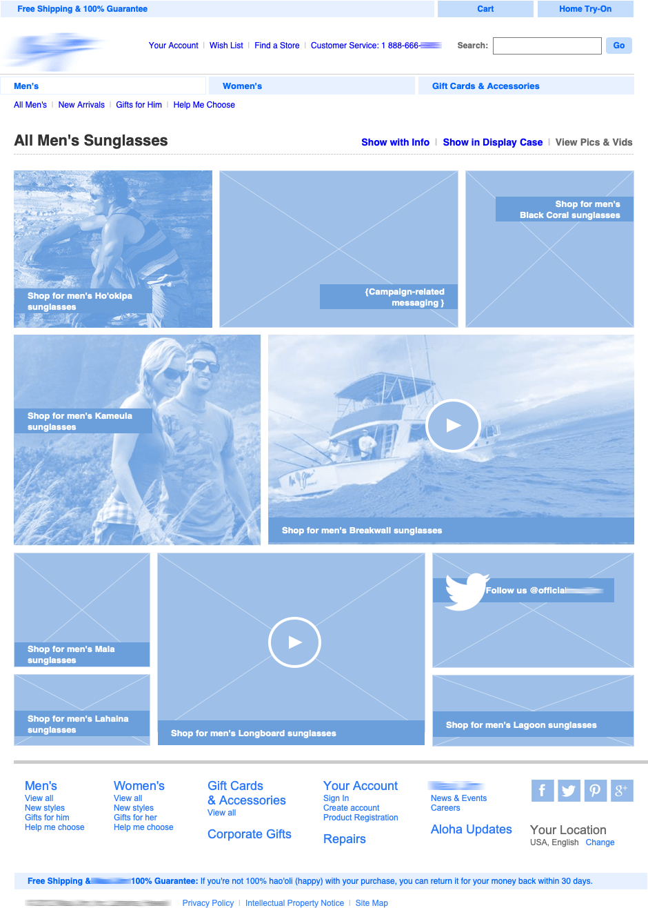 Branded content about product categories and specific SKUs ( View image )
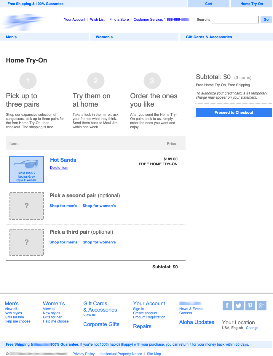 Wireframe of Home Try-on screen( View image )
A pilot home try-on program reinforced superior optics, style and fit. It reduced risk for the consumer and fostered user-generated content in social channels.