A national garage door franchisor boosted leads and shortened sales cycles by launching a structured, product-forward website.
 The challenge
How might a nationally recognized home services brand bring clarity to a fragmented digital presence?
 About the Project
This project delivered a comprehensive UX audit, a prioritized recommendations matrix, and supporting wireframes for the manufacturer's website, a digital property serving the company's garage doors franchise division. The site represented a significant franchise network offering garage doors, garage door repair, garage door openers, entry doors, and related installation and emergency services.
Key Impacts
Actionable Roadmap
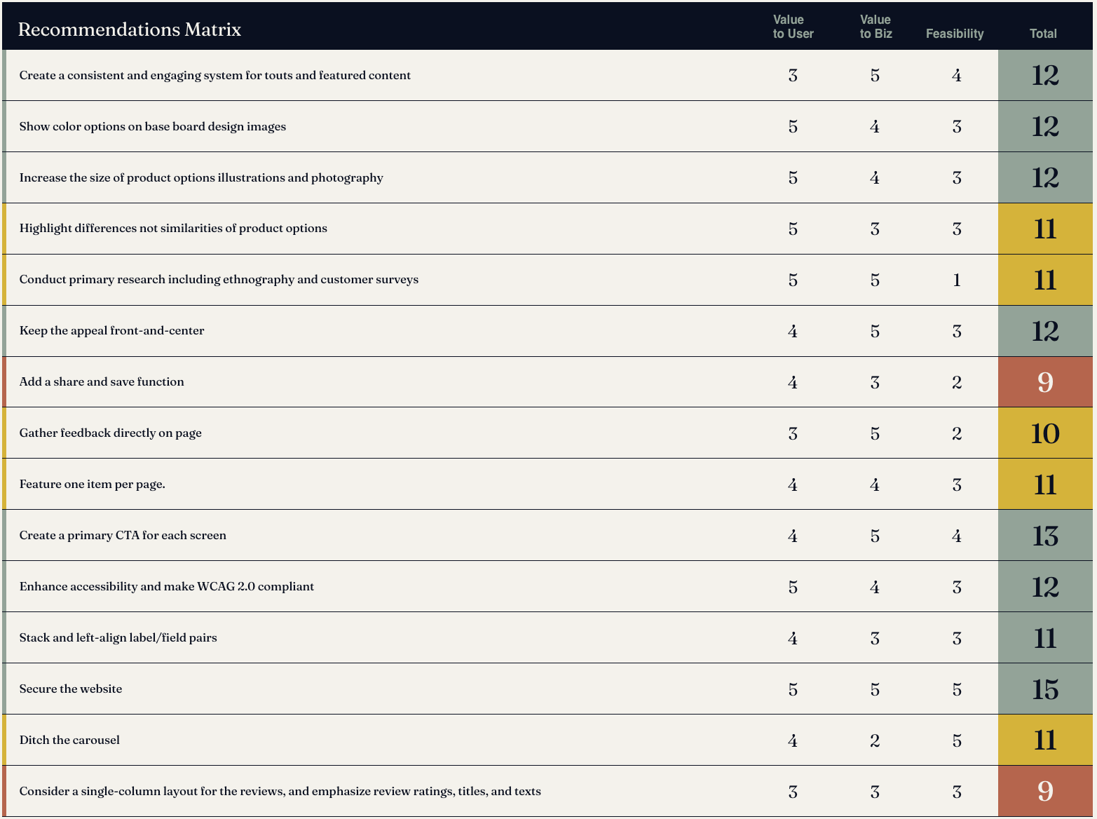
A prioritized matrix of 38 findings, scored by value and feasibility, replaced a generic list of problems with a sequenced investment plan for near- to long-term growth.

Transactional Gaps
The audit flagged the inability to purchase items like openers directly as a high-value opportunity, recommending future integration with the manufacturer's website for sales completion.

Structural Clarity
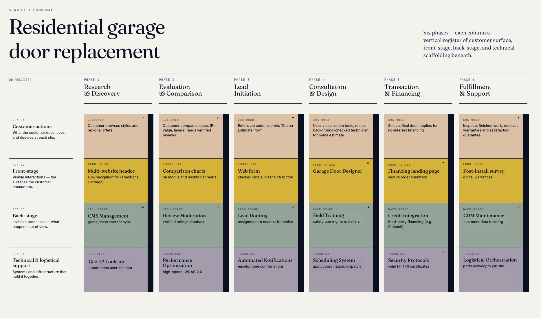
New wireframes for primary, secondary, and tertiary pages resolved existing ambiguities, helping users correctly interpret page hierarchy and content relationships.
Focused Momentum
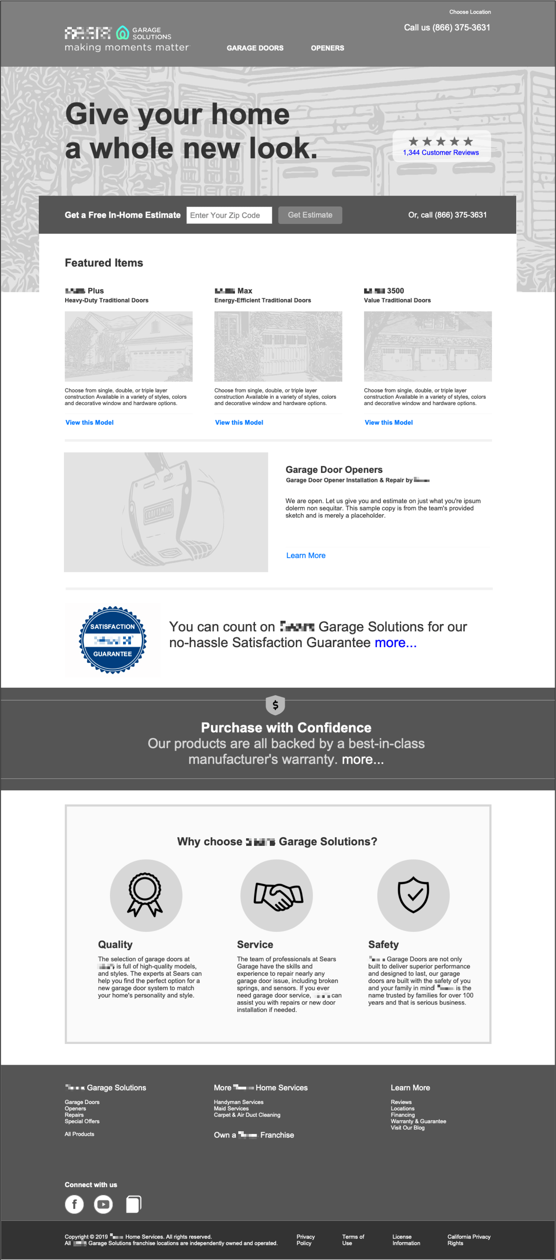
Replacing the homepage carousel with a single CTA reduced attention fragmentation (84% of views on a carousel's first slide), directing traffic toward high-value actions like "Get an Estimate."
Edward Stull Consulting conducted a systematic evaluation of the site and produced three primary deliverables: a detailed service and experience audit organized around five guiding principles, and a recommendations matrix scoring each finding by value to user, value to business, and implementation feasibility.
Five guiding principles
1. Simplify and Clarify Identity The site’s fragmented branding and cluttered headers cause user confusion. Recommendation: Establish a single dominant brand identity using a multi-website header pattern. Streamline navigation to three core categories, shorten labels, and reserve buttons strictly for primary calls-to-action.
more
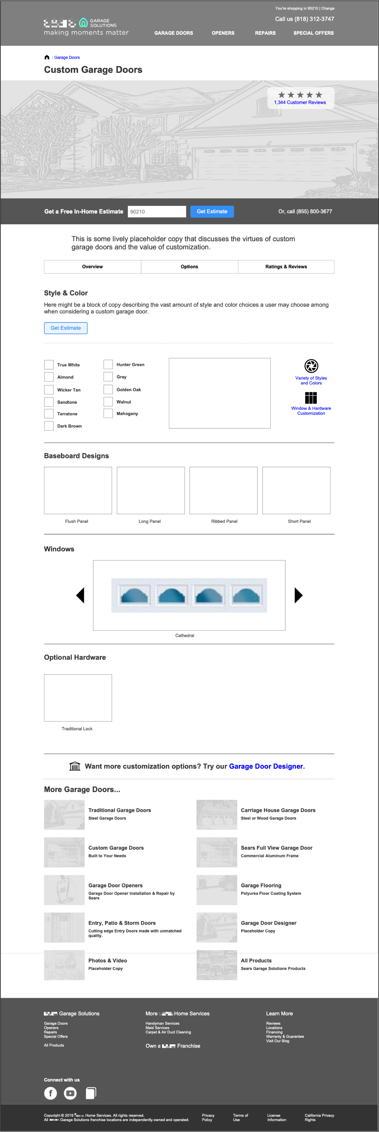
2. Prioritize Product Discovery Promotional "noise" currently outweighs product content, forcing users to rely on navigation as an "escape hatch." Recommendation: Move products to the forefront of the homepage and category screens. Implement an "All Products" page with robust filtering and an inspiration gallery featuring "Buy this look" functionality.
3. Standardize Page Hierarchy Inconsistent layouts and mismatched link/headline labels make it difficult for users to track their location within the site. Recommendation: Create distinct, standardized templates for primary, secondary, and tertiary pages. Ensure every link label matches its destination headline to maintain scent of information.
4. Purpose-Driven Design Many pages lack clear utility or specific calls-to-action (CTAs). Recommendation: Assign a target persona and one primary CTA to every screen. Replace competing promotions with share/save tools to assist collaborative buying decisions and use customer surveys to ground future content in verified needs.
5. Improve Accessibility and Trust The site suffers from poor legibility, dense data tables, and a critical lack of HTTPS security. Recommendation: Implement WCAG 2.0 standards, increase font sizes, and simplify forms. Immediately secure the site with HTTPS and replace the homepage carousel with a single, high-impact featured CTA.
Recommendations Matrix
The 38 audit recommendations were scored across three dimensions — Value to User (1–5), Value to Business (1–5), and Feasibility (1–5) — and color-coded by implementation horizon: green (near-term), yellow (mid-term), and red (long-term). The highest-scoring recommendations (score of 15) were unanimous across all three scoring dimensions, signaling that they were simultaneously high-value to users, high-value to the business, and highly implementable — a rare combination that made them unambiguous starting points for the remediation effort.
Wireframes
Supporting wireframes translated the highest-priority audit recommendations into tangible design directions. These wireframes addressed the homepage layout, product category screens, and key service pages, demonstrating how a simplified navigation hierarchy, product-forward layouts, primary CTAs, and improved brand architecture would function in practice. The wireframes served as low-risk, implementation-ready blueprints allowing the client team to move toward visual design and development without resolving fundamental IA and UX questions mid-build.
 Impact
- Actionable Roadmap: A prioritized matrix of 38 findings, scored by value and feasibility, replaced a generic list of problems with a sequenced investment plan for near- to long-term growth.
- Transactional Gaps: The audit flagged the inability to purchase items like openers directly as a high-value opportunity, recommending future integration with the manufacturer's website for sales completion.
- Structural Clarity: New wireframes for primary, secondary, and tertiary pages resolved existing ambiguities, helping users correctly interpret page hierarchy and content relationships.
- Focused Momentum: Replacing the homepage carousel with a single CTA reduced attention fragmentation, directing traffic toward high-value actions like "Get an Estimate."
- Reduced Stakeholder Paralysis: Categorizing recommendations into implementation horizons made the project scope manageable, separating immediate "quick wins" from complex, long-term investments.
- Evidence-Driven Strategy: Highlighting the need for ethnographic research acknowledged the limitations of heuristic analysis, positioning the team to reduce uncertainty through direct user data.
- SEO Consolidation: Integrating the separate Garage Door Designer tool into the main site eliminated SEO cannibalization, pooling search authority into a single domain.
- Increased Lead Volume: Implementing clear branding and product-forward layouts removed barriers to trust and comprehension, significantly boosting conversion rates.
- Inspiration-Led Traffic: A "Buy this look" gallery captures the "top-of-funnel" homeowner looking for inspiration rather than technical specifications, reducing bounce rates.
- Shortened Sales Cycles: Share-and-save features support the collaborative nature of home improvement, facilitating the joint household decisions that typically precede a purchase.
- Expanded Audience: A WCAG 2.0-compliant design makes the site accessible to users with disabilities, a key demographic for home services, while improving the mobile experience for everyone.
more
Other Notable Projects
- Research, synthesis, and workshops for a global cooperative and clients of its flagship product
- Design research studies for a technology provider of a nationwide learning management system (LMS).
- UX and IA for numerous consumer package goods (CPG) ecommerce websites, multiple CPG brand websites, and several social media games and sweepstakes